There's a research paper in the financial world called the Trinity Study. The paper seeks to answer the question how much one may annually withdraw from one's retirement portfolio, as a percentage of net worth, and probabilistically avoid the misfortune of outliving one's savings.[1] The withdrawal-rate question quantifies how much one must save to afford one's expected standard of living through retirement. Clearly this is an important question for anyone contemplating their financial goals.
I'm unconvinced that the safe-withdrawal question is framed correctly, though, because I'm unconvinced that the net worth metric is an accurate or particularly useful indicator for evaluating a portfolio's retirement potential. Net worth has mostly a qualitative usefulness: holding all other factors to be equal, a greater net worth is better than a lesser net worth. But of course all other factors are rarely if ever held to be equal. The market fluctuates. $1 million invested before a market crash does not seem to be worth the same as $1 million invested after that crash. Market volatility is exactly why papers like the Trinity Study seek a mere probabilistic determination of retirement safety. The safe-withdrawal question may never graduate from the probabilistic to the deterministic because of the inherent vicissitudes of financial planning and execution, yet perhaps these types of studies seeking such heuristics are misguided.
What I wonder is: why does the financial world so stubbornly cling to the idea that net worth is the one true metric of financial worth?
 Figure 1: S&P 500 Index historical P/E values.[2] Click to enlarge.
If one had $1 million invested in the stocks composing the S&P 500 Index at the turn of this century, when the S&P 500 had a three-year trailing price-to-earnings ratio of about 30, then that $1 million was invested in a collection of stock assets that represented about $33k in annual corporate earnings. Whereas if one has $1 million invested similarly today, now that the three-year trailing P/E ratio is about 20, then the collection of stock assets earns about $50k annually. In both cases $1 million is invested. In both cases net worth is the same. However, in the first case the assets are earning substantially less than in the second case, and therefore the first case's $1 million net worth statistic is arguably inflated compared to the second case's $1 million. Net worth alone is a misleading metric.
P/E ratios are not new, and neither are the slew of various metrics used in value investing. These metrics are used for making investment decisions like picking stocks and choosing a portfolio diversification strategy. The problem is that these metrics are used for making investment decisions but no such diverse wealth of metrics exists for assessing the fundamental value of that portfolio. Yet such an assessment must be made to determine the retirement potential of that portfolio. Portfolio value assessment remains married to the idea of net worth.
The primary problem with assigning so much importance to one's net worth is that net worth is forever doomed to follow volatile fluctuations based on the fragile psychology of the market. Instead consider a net earnings metric, as used in the previous example of investing in the S&P 500 Index. Whereas net worth measures the price other people are willing to pay for all of one's assets (the $1 million), net earnings measures the summation of those assets' underlying earnings ($33k and $50k per year in the two cases) and is based on corporate accountants' spreadsheets rather than investor's judgments. This better anchors assets' valuation to their fundamentals.
Net earnings shouldn't be a replacement for net worth, just how on-base percentage isn't a replacement for batting average. The metrics should supplement each other to balance their weaknesses. Any net earnings number has the Enron consideration: earnings too have the potential to depend on false data driven by market psychology and to fluctuate wildly. One problem with this scenario is that in such a case it is likely that the net worth metric is also overinflated. A third metric is needed, or perhaps it is wise to consider longer, multiple-year trailing earnings numbers, as is shown in the graph above with the three-, and five-year trailing P/E ratios. Predictably, the one-year data line in the chart denotes significant volatility while the three- and five-year lines are smoother.[3]
I think 401k and other retirement account statements should display net earnings next to the portfolio's balance. The balance states what the portfolio is worth to others, and the net earnings states what the portfolio is generating by way of new underlying wealth. One immediate benefit to showing the net earnings is that it would cast portfolios in a more favorable way. This year has been a terrible year for stocks, yet even while corporate earnings statements have been down from the previous year, the multi-year trailing P/E ratios continue to trend downwards, thus signifying that portfolios are continuing to gain value at least by one metric.[4].
[1 The Charybdis to old-age destitution's Scylla is working too hard for too long and saving more money than can be spent in the remainder of one's lifetime. This is a problem because it signifies that one has wasted the most precious resource of all: time. The Trinity Study and similar papers seek to find the maximal safe-withdrawal rate to avoid spending more time than is necessary to accrue wealth to afford one's desired standard of living.
[2] Source: standardandpoors.com. The data is available as a spreadsheet readable in Microsoft Excel or Open Office Calc, and the site has a substantial number of other interesting data sets. You too can create your own nifty charts.
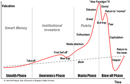
[3] Here's a side note. The average P/E ratio for the S&P 500 Index for the period 1936-2008 is 15.9, which is in line with conventional wisdom. The last time the one-year trailing P/E ratio was below 15.9 was in 1995. The last time the three- or five-year trailing P/E ratios were below 15.9 was in 1991. It appears we have been in an extended period of historically inflated asset values. In fact, the above P/E chart reminds me of this chart, which presents a particular qualitative take on market bubbles.
[4] This year has been terrible for nearly all types of investments and not just stocks. Real estate has also done poorly, especially in metropolitan areas such as Phoenix. I leave it as an exercise for the reader to apply the net earnings metric to real estate holdings.
1 comment:
You should be reported.
Net earnings? Shown on portfolios? Displayed on 401k statements? Great ideas!
I'm reporting you to Scott Burns - good idea for a future article.
Post a Comment